Why the Position of Your Call to Action Buttons Really Matters
If you want your call to action buttons to be effective then you need to understand the psychology of the users visiting your site. It’s well known for instance that a red ‘buy now’ button is more likely to get clicked than any other color and this is just one example of many of the tricks that internet marketers can use to increase their conversions.
But did you know that the position of your buttons also makes a huge difference?
This is all to do with the way that we naturally consume and explore information. When a user lands on your web page, they will tend to progress through the information there in a predictable way. Understanding this allows you to arrange your content in such a way that it gets seen in the correct order and thus control the way that your readers feel at any given point during their consumption of your text.
In short, the objective is then is to place your call to action buttons in the position where your readers will see them last and this will greatly increase their chances of clicking.
Where is the Terminal Area?
When someone lands on a home page, the first thing they will normally see is an image of the product, a headline, the supporting text and a call to action button. These are generally positioned to be in the focal point where our eyes naturally rest on loading a new page and the users will take in that information starting from the top left and moving downwards.
Your aim is to make sure that they see your headline/product image, then learn about why they should become a paying customer and then see the call to action button. This is important because if they see the button before they know what it is they’re buying, then they’ll be much less likely to click buy. Likewise, once they’ve finished learning about your business, they shouldn’t then have to make a conscious effort to search for your button and learn how to buy.
This perfect spot that follows on from your other content is what’s known as the terminal area.
So with that in mind… where precisely is this terminal area? Simply, it’s the spot at the bottom right of your home page and the bottom right in relation to your focal point. We read from top to bottom and from left to right and so something that is positioned at the bottom right is more likely to be the last thing seen.
The Gutenberg Diagram
This concept comes from the Gutenberg Diagram which was originally posited by Edmund C. Arnold. This diagram is often referred to when optimizing displays that only have a limited number of elements and it works by dividing any given page into four sections. The top left is now your primary and initial focal point and the terminal area is at the bottom right.
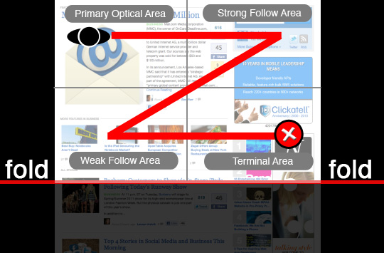
Another similar concept is the ‘F-layout’ which is a heat map of where users tend to look on a new web page. First they look along the top, then they look along the middle/just above the middle and then they look down the left side. This is why these spots are perfect for headers and menus but not buy now buttons. If your buy now button is on the bottom left, then your users will look there right at the start when they’re looking for the menu!
The Take-Home Message
The take-home message from all this is simple: your call to action buttons should be positions on the bottom right of your web pages if you want them to be effective. Many users will make the mistake of placing their buttons on the bottom left but countless hours of split testing and research by older and wiser internet marketers show us that sales go up when you move your button to the right. According to the Gutenberg diagram that bottom left square is the ‘weak follow area’ – in other words, the worst spot for anything important.
Of course there are exceptions to this rule. For narrow, centralized landing pages you can have your call to action in the middle as long as it’s at the bottom for instance (and likely you’ll have it interspersed throughout the text as well). In general though, moving your buttons slightly to the left can increase your profits. It takes two seconds to do, so what are you waiting for?