Call Today! 1-888-809-0219

Blog

Posts Tagged ‘conversion rate optimization’

Super Simple A/B Tests You Need for Your Website

Posted on: February 16th, 2015 by admin

“I don’t care for best practices, I care for conversions. That’s why I test.” 

-Michael Aagard, ContentVerve.com

 
If you’re not tech savvy or you’re new to the business world, implementing A/B tests on your website can be intimidating and sound like a lot of work. But the truth is, you don’t have to be an expert to get the results you’re looking for. Thankfully, there are companies who did the research for you so that testing your website will be a breeze:


CALL TO ACTION

Your website’s “Call to Action” is a key instrument in growing your business. Even testing the slightest changes can give you a higher conversion rate. First, try testing the color and placement of your CTA button. You can try doing something like Hubspot, who conducted an experiment that –surprisingly– resulted in the color red proving higher conversion rates than the color green on a CTA button.

Screen Shot 2015-02-15 at 11.15.00 PM

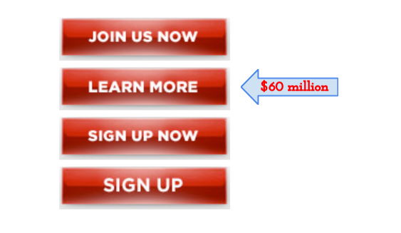
Or you can run an experiment like President Obama who raised $60 million by simply changing the CTA button wording from “Sign Up” to “Learn More.” Either way, you’re sure to get results as well as increase and impact user behavior when you test your CTA.


PAGE LENGTH

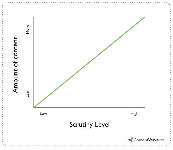
Should your landing pages have long or short forms? Interestingly, marketers seem to be divided into two groups — those who claim shorter is better and those who claim longer is better. To find the truth, ContentVerve.com ran case studies that tested long and short forms for different companies. As it turns out, both marketers are right: it all depends on what you want from your customers and what products you offer. Short pages are better for low commitment and low risk offers, whereas longer pages benefit from high commitment and high risk offers. Depending on your business, you may want to start by testing out page lengths on your site.

contentverve


COLUMNS

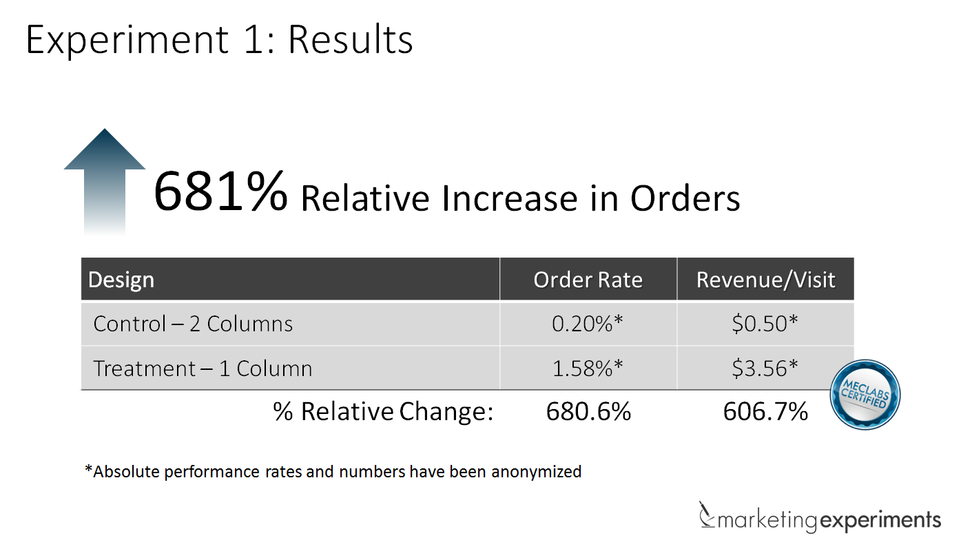
Why are columns a big deal? Maybe because finding the best page layout could increase conversion rate by 681%! MECLABS ran a test that proved switching from a multiple to a single column layout could significantly increase sales for a tech company. Results like that will definitely vary from site to site, but it’s obvious that having a multiple or single column layout makes an impact on any website. That’s worth testing, don’t you think?
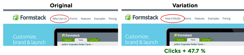
 results-for-1-column-vs-2-column-test
 

NAVIGATION BAR

Utilizing your navigation bar enhances, and promotes more, user experience. Try figuring out the most influential layout that makes the biggest impact on customer’s behavior. You could switch the order of your tabs to direct traffic to the pages that are crucial for leads and sales. Even something as simple as testing different wording on each tab may tell you what gets you the most clicks. One test ran by Optimizely showed that changing a tab from “Why Use Us” to “How It Works” increased clicks by 47.7%.

formstack-nav-old-v-new


IMAGES

The biggest subliminal impact on your customers comes from optimizing your images. Depending on the type of industry you’re in, you will want to test out how featuring images of people or product can make conversion rates increase dramatically. And here’s something else to consider: bigger might be better. Econsultancy wrote about three case studies that demonstrated how enlarging the “hero shot” on a webpage page can also enlarge the conversion rate. But don’t just test size — consider other options such as using illustrations instead of photographs — or even creating an aesthetically pleasing negative space, like Apple.com’s monochromatic design.
 Screen Shot 2015-02-15 at 11.43.15 PM
 

SPECIAL OFFERS

It seems obvious that people generally prefer to have more options when it comes to making purchases. However, providing too many options can actually drive customers away. One company wanted to increase cart completions by simplifying the checkout process. They originally had three offers that a visitor had to select before checking out. Instead, the company integrated the options into the product details and focused on the checkout CTA. It resulted in 36.5% more cart completions. So it pays to test how simplifying CTA can influence the direction of your customer, even if that means simplifying your special offers and deals.

Shopping-Cart-Results


HEADLINES

Have you tested out the main text on your pages? You really should — it’s easy to generate more clicks and visitor engagement by simply modifying your header. WhichTestWon investigated how the layout and wording of different headers and sub-headers influenced the CTA to sign up. As it turns out, creating a more concise header with lesser details specified in the sub-header proved to increase sign up rates by 37%.

test1
 
 
Though the results of all these tests provide helpful guidelines for you, it’s important to remember that no industry has the same targeted demographic or product offerings. There can’t be a one-size-fits-all solution for improving your business website, which is why data should be the driving force behind the changes on your website.


Is it Best to Have your Call to Action on the Right or Left?

Posted on: February 14th, 2015 by admin

Why the Position of Your Call to Action Buttons Really Matters

If you want your call to action buttons to be effective then you need to understand the psychology of the users visiting your site. It’s well known for instance that a red ‘buy now’ button is more likely to get clicked than any other color and this is just one example of many of the tricks that internet marketers can use to increase their conversions.

But did you know that the position of your buttons also makes a huge difference?

This is all to do with the way that we naturally consume and explore information. When a user lands on your web page, they will tend to progress through the information there in a predictable way. Understanding this allows you to arrange your content in such a way that it gets seen in the correct order and thus control the way that your readers feel at any given point during their consumption of your text.

In short, the objective is then is to place your call to action buttons in the position where your readers will see them last and this will greatly increase their chances of clicking.

Where is the Terminal Area?

When someone lands on a home page, the first thing they will normally see is an image of the product, a headline, the supporting text and a call to action button. These are generally positioned to be in the focal point where our eyes naturally rest on loading a new page and the users will take in that information starting from the top left and moving downwards.

Your aim is to make sure that they see your headline/product image, then learn about why they should become a paying customer and then see the call to action button. This is important because if they see the button before they know what it is they’re buying, then they’ll be much less likely to click buy. Likewise, once they’ve finished learning about your business, they shouldn’t then have to make a conscious effort to search for your button and learn how to buy.

This perfect spot that follows on from your other content is what’s known as the terminal area.

So with that in mind… where precisely is this terminal area? Simply, it’s the spot at the bottom right of your home page and the bottom right in relation to your focal point. We read from top to bottom and from left to right and so something that is positioned at the bottom right is more likely to be the last thing seen.

The Gutenberg Diagram

This concept comes from the Gutenberg Diagram which was originally posited by Edmund C. Arnold. This diagram is often referred to when optimizing displays that only have a limited number of elements and it works by dividing any given page into four sections. The top left is now your primary and initial focal point and the terminal area is at the bottom right.

gutenberg-diagram1

Another similar concept is the ‘F-layout’ which is a heat map of where users tend to look on a new web page. First they look along the top, then they look along the middle/just above the middle and then they look down the left side. This is why these spots are perfect for headers and menus but not buy now buttons. If your buy now button is on the bottom left, then your users will look there right at the start when they’re looking for the menu!

The Take-Home Message

The take-home message from all this is simple: your call to action buttons should be positions on the bottom right of your web pages if you want them to be effective. Many users will make the mistake of placing their buttons on the bottom left but countless hours of split testing and research by older and wiser internet marketers show us that sales go up when you move your button to the right. According to the Gutenberg diagram that bottom left square is the ‘weak follow area’ – in other words, the worst spot for anything important.

Of course there are exceptions to this rule. For narrow, centralized landing pages you can have your call to action in the middle as long as it’s at the bottom for instance (and likely you’ll have it interspersed throughout the text as well). In general though, moving your buttons slightly to the left can increase your profits. It takes two seconds to do, so what are you waiting for?

Credit Here


How to Use Google Analytics to Track Conversions

Posted on: December 2nd, 2013 by admin

Google Analytics is a free service provided by Google to marketers who want to track conversion behaviors to their websites. The service collects data about visitors such as where they originated, how long they remained on a certain page and other important information. Google Analytics has the ability to track the visitors referred by search engines, direct visits, social networks, display advertising, referring sites, email marketing, pay-per-click and links within PDF content.

 The basic service is free or you can upgrade to a paid service.

Paid training courses on how to use the service are taught in major cities across the country and online. Many marketers use the free online instructions provided by Google. These tutorials are comprehensive with written content and videos to help you learn what to do to begin analyzing your website. This article concentrates on tracking conversions using Google Analytics.

Conversions

Conversions are goals set by the owner of a site. A website is created to meet one or several goals. A goal is met when a visitor performs a desired action such as:


  • Spending a specific amount of time on the website
  • Viewing a specific number of pages
  • Accessing a specific page
  • Downloading a file

Each of these goals is found within one of the three major goal categories in Google Analytics:


  1. URL destination goal: measures performance based on visitors who accessed a certain page and visitors that didn’t

2.  Time on site goal: measures the preset minimum and maximum amount of time a visitor spent on the site

3.   Pages/visits goal: measures the preset minimum and maximum number of pages a visitor accesses during a visit


How to Setup Goals in Google Analytics

1.    Under analytic settings, go to “Select Profile Settings”

2.    Click on “Add Goal.”

3.    Enter goal details:


  1. Enter name of the goal
  2. Select the goal type (URL, time, pages/visits)
  3. Fill in the information according to goal type as shown below:


MetricURL Destination GoalTime on Site GoalPages/Visit Goal
ConditionHead match: matches corresponding URL plus additional parameters at end of string

Exact match: match exact URL

ReGex match: matches URL depending on regular expressions

Greater than, less thanGreater than, equal to
ValueGoal URL: destination page you want visitor to accessDetermine the target time: hours, minutes, seconds


Determine the target number of pages to be viewed
Goal ValueDetermine goal valueDetermine goal valueDetermine goal value


  1. Choose whether or not to add a *funnel for URL destination match goals.


* A funnel is a predetermined navigational path set by the marketer for the visitor to reach the conversion page.

The goal value is determined by what each goal brings to the company from the e-commerce perspective. For example, if your sales team closes 10% of the visitors who request a call back and the sale is approximately $500, then the goal value is $50.00.

Google Analytics will help you determine which marketing campaigns are the most effective for your business. Not only will you be able to increase your efforts with the most effective campaigns, but you’ll also know which campaigns to suspend or revamp. This is an accurate marketing tool that can accurately help you get the most from your website.


Best SEO Firm Sitemap
5533 Point Pleasant Pike Doylestown, PA 18902